Sketch Fest – Website
A platform for the festival to run on: it explains what Sketch Fest is, takes bookings, and gives partners a way in. Designed and built, not yet launched.
Sketch Fest had been running on messages, posts and a spreadsheet. This replaces it: somewhere the festival can be found, understood and booked, and somewhere a partner can start a conversation.
Four pages, and no menu deeper than one level.
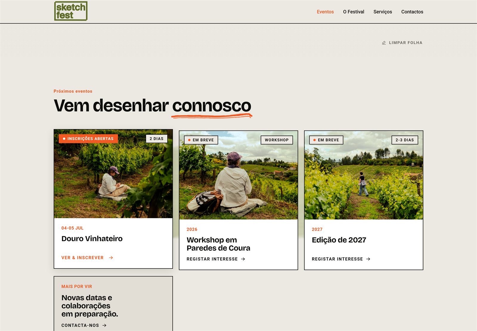
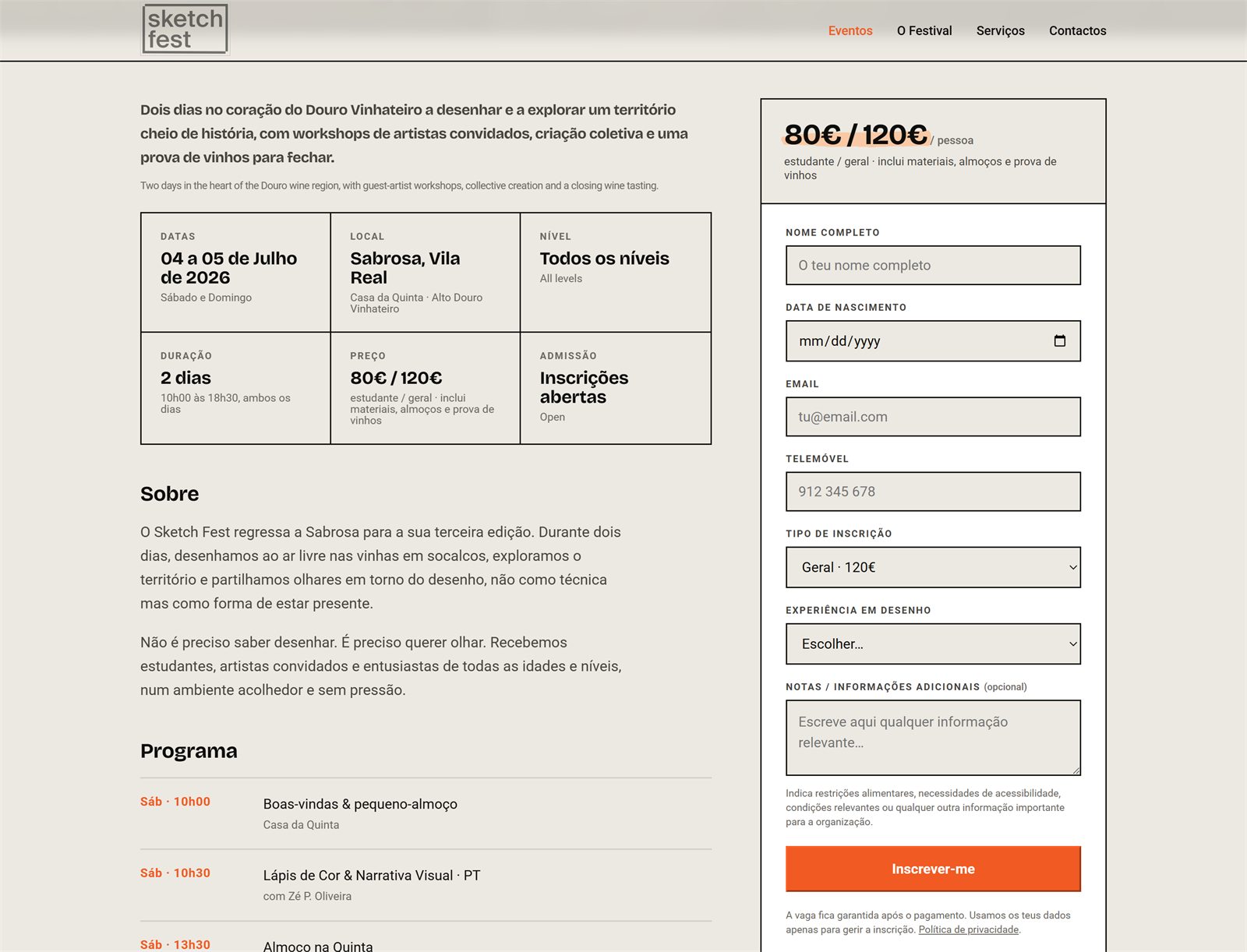
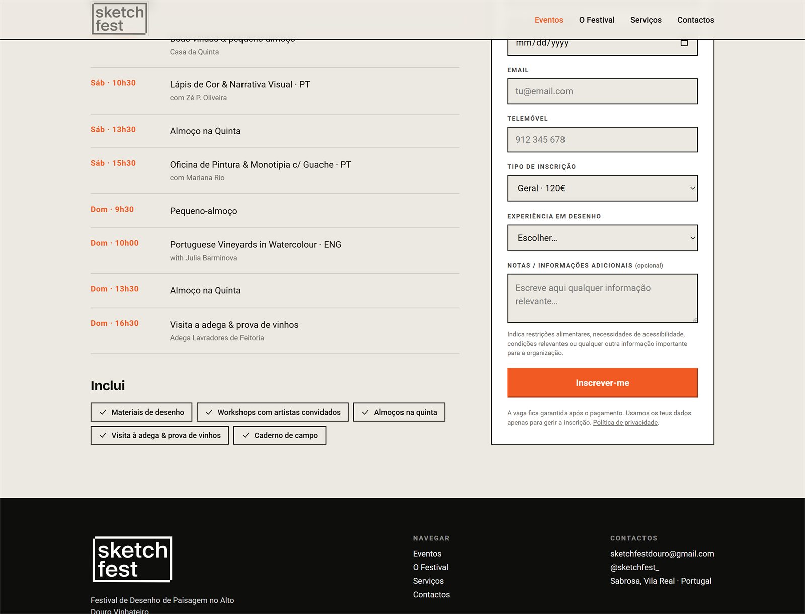
It asks you to draw first
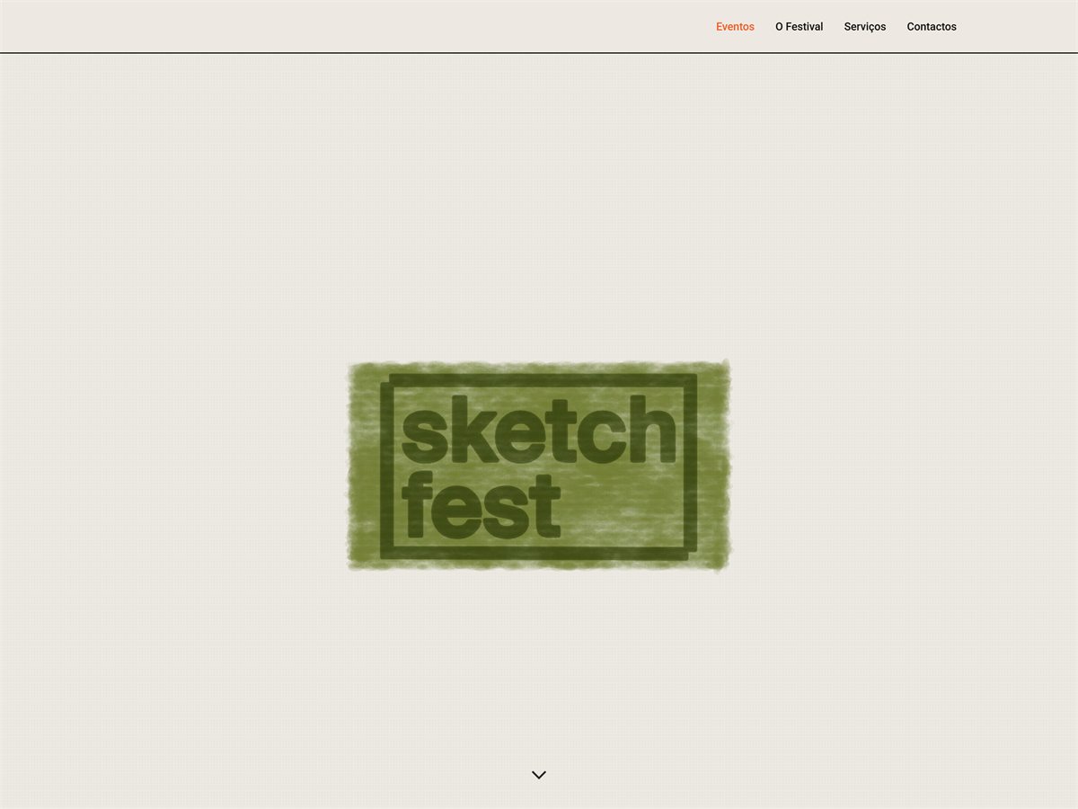
The homepage opens on a blank sheet. Moving the cursor lays down graphite and the wordmark develops out of the paper. Scroll, and the sketch melts into a wash while the mark flies up to the toolbar, where it stays for the rest of the visit.
Nothing appears until you make one, which is the argument of the festival stated as a mechanic.
Everywhere else, scanned brush and pencil marks underline headings and wipe across the screen between pages, so a page change reads as something drawn rather than something loading.
Both previews are recordings of the site itself, played back here as a stepped image sequence rather than a video.
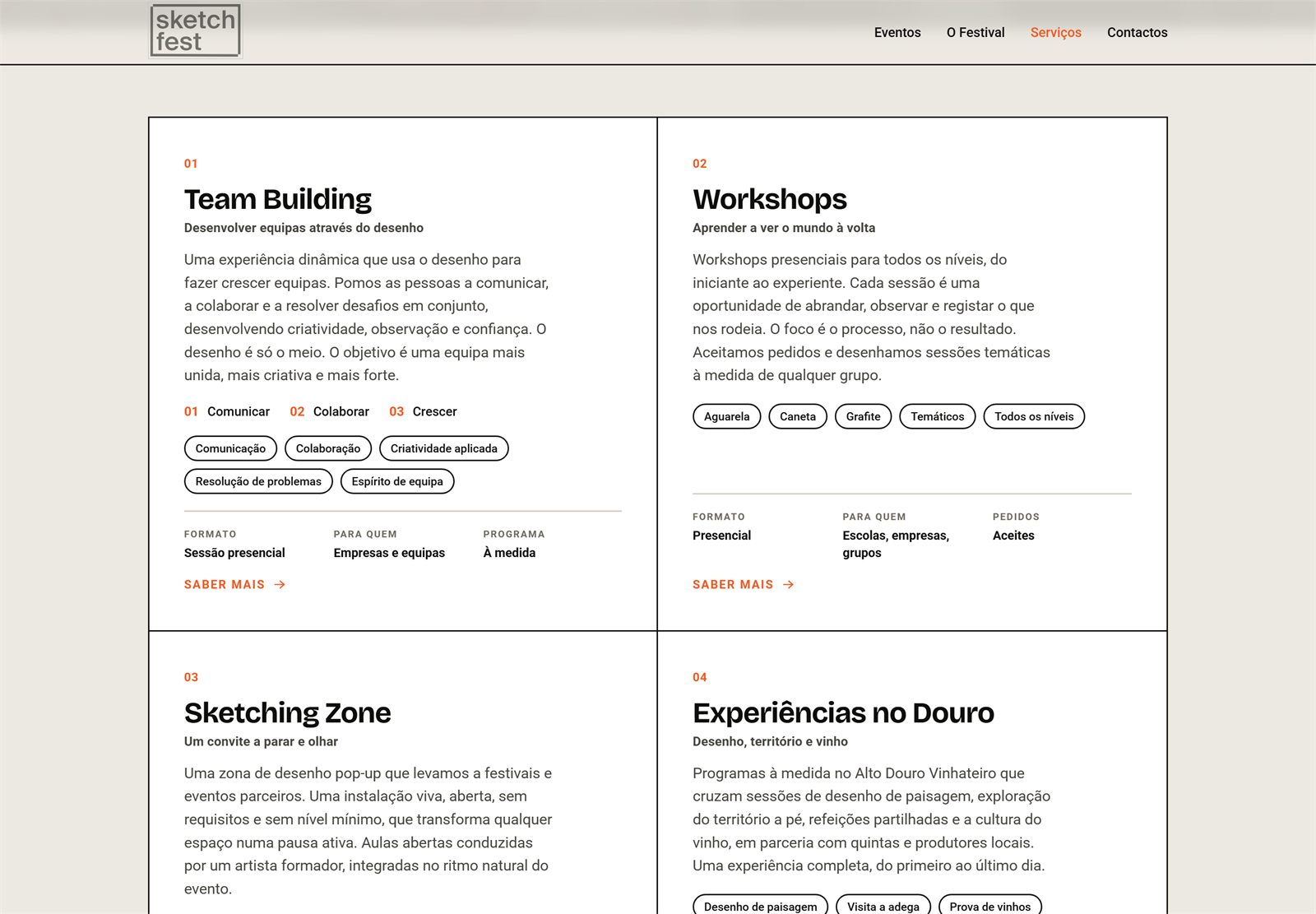
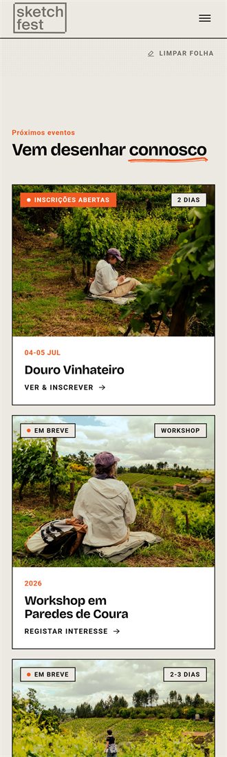
Built
Static HTML and CSS, no framework and no CMS, with bookings landing in a sheet. The drawing surface is a canvas and about three hundred lines of JavaScript, and the only part of the site that is not a plain document.
Not launched yet. The pages, the navigation and the booking flow all work; everything shown here is the real thing, running locally.
Credits
Built for Sketch Fest, co-founded with Isabel Seixas. The festival’s visual identity is not mine; my work here is the platform, its structure and its behaviour. Photography from the Alto Douro Vinhateiro.